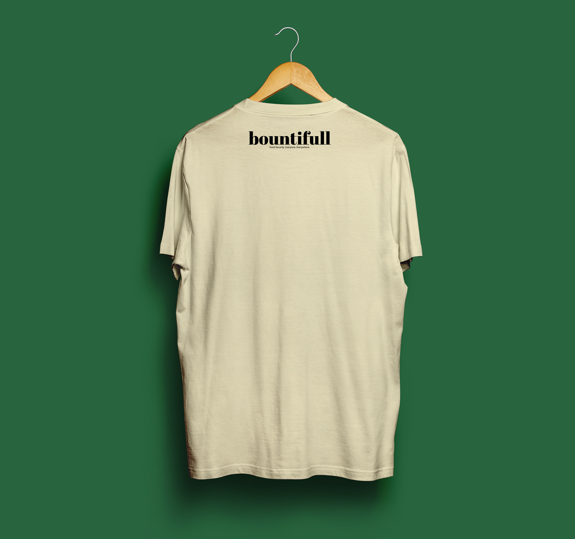
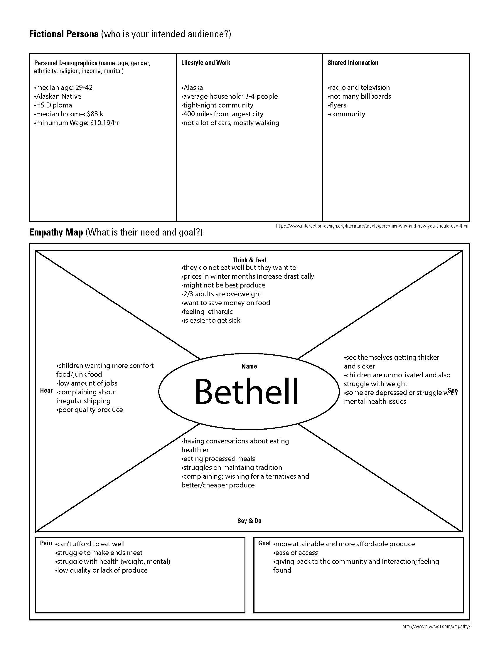
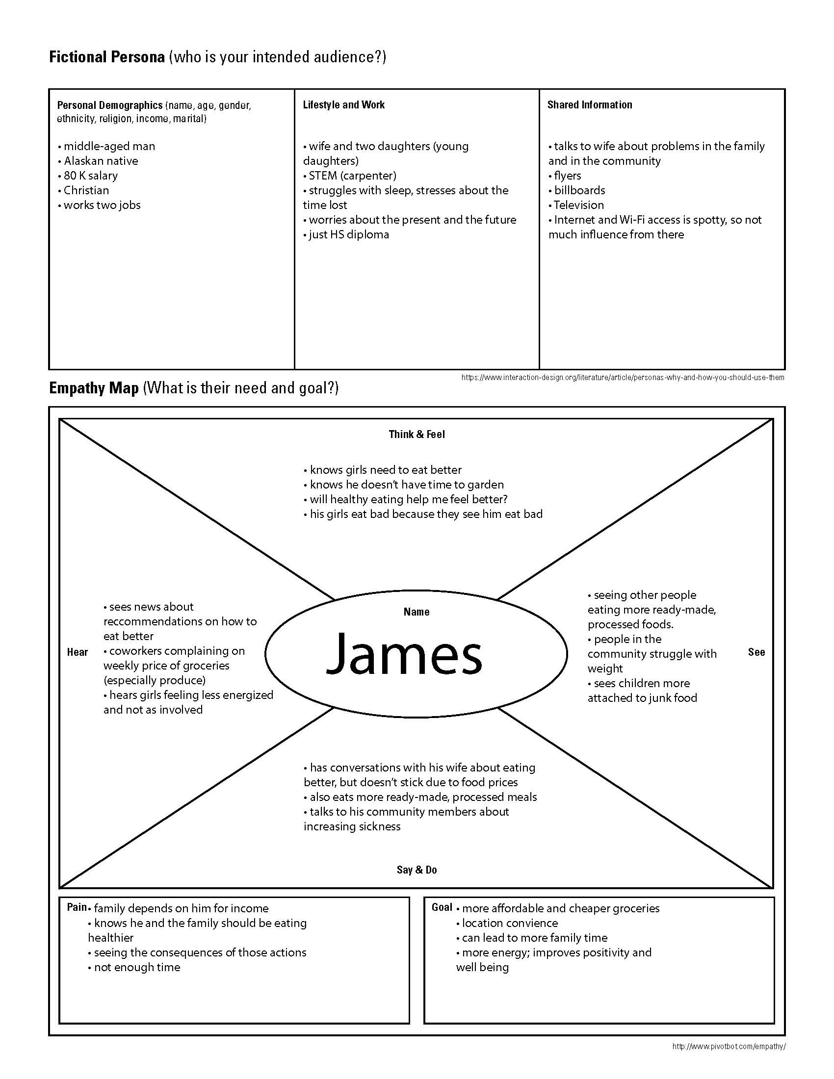
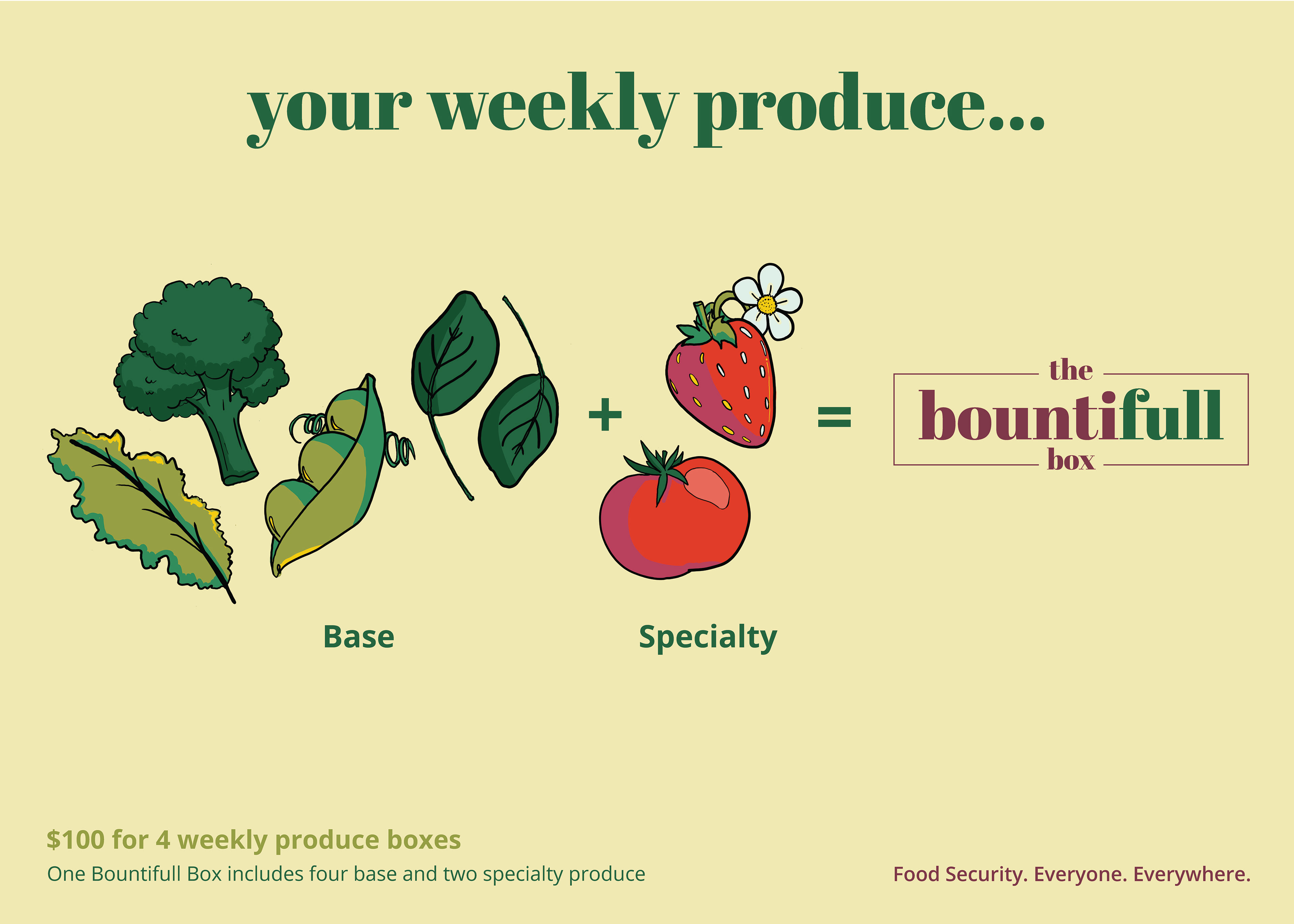
Bountifull envisions an Alaska where no child, woman, and man will worry about food-insecurity. Their mission is to increase access to fresh, quality, and affordable produce, and increase awareness of ways to utilize that produce in everyday life for households in Alaska.
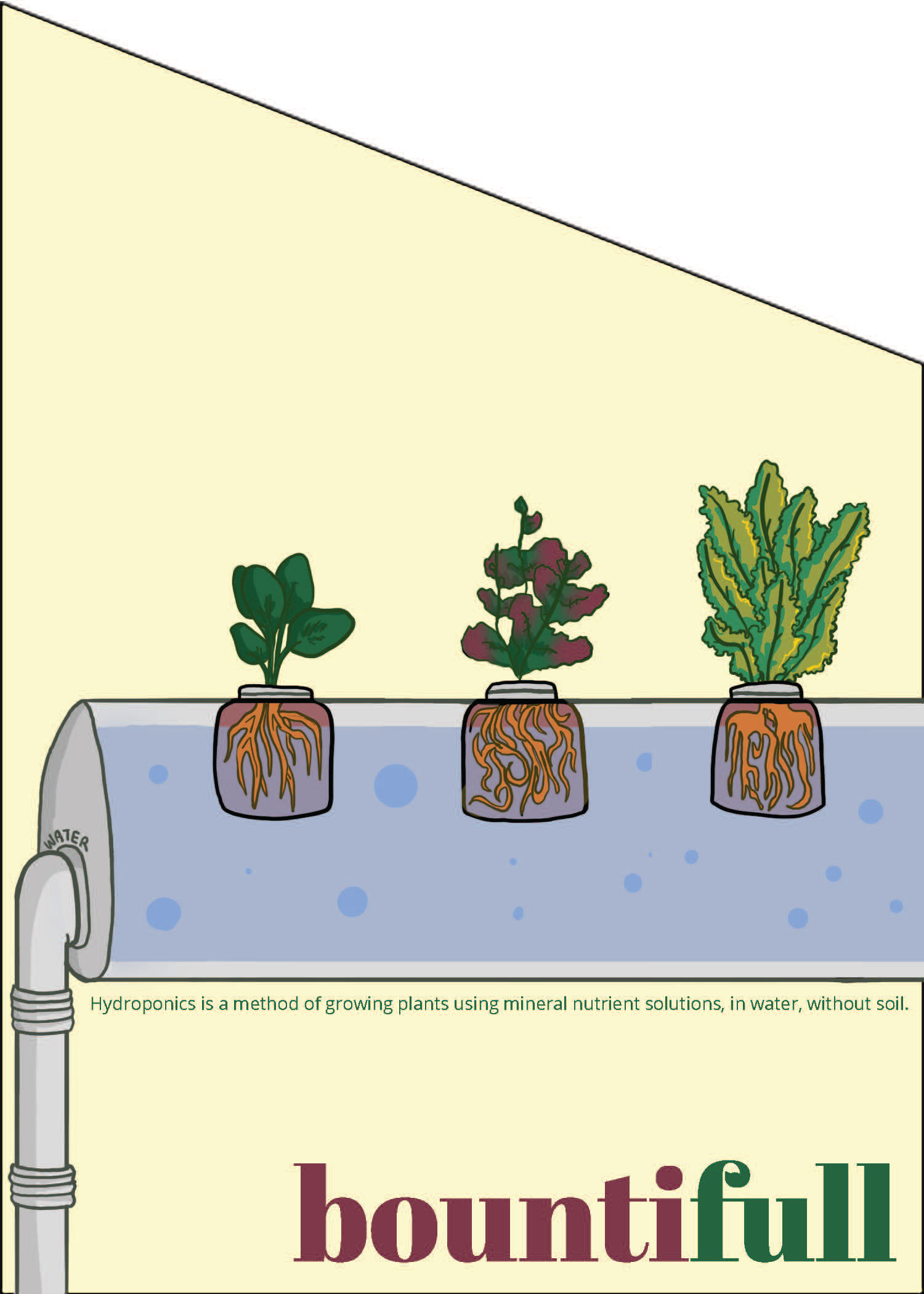
Food insecurity, or the inability to access safe and nutritious food, affects 1 in 7 Alaskans. The situation is so dire that if the AK were cut off from access to the world, they would only have enough emergency reserves of food to feed the entire state for three days. A lack of nutritious food also results in distressing health complications, so that Alaskans are more likely to suffer from heart disease and obesity. Bountifull addresses this lack of access through cold-weather, hydroponic greenhouses. Each greenhouse is automated, 8x10ft, produces 108 plants roughly every month, and can be pushed together into larger quadrants.

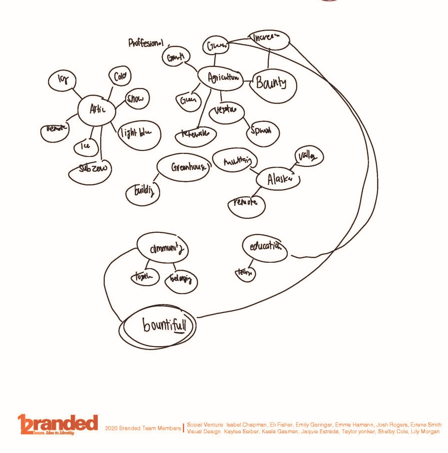
Process: Naming
Before there was Bountifull, the original company name was ColdCrops. The branding designers brainstormed potential name changes through focus on the company's five commitments: Food Security, Individual Wellness, Community Development, Environmental Sustainability, and Thriving Alaska.
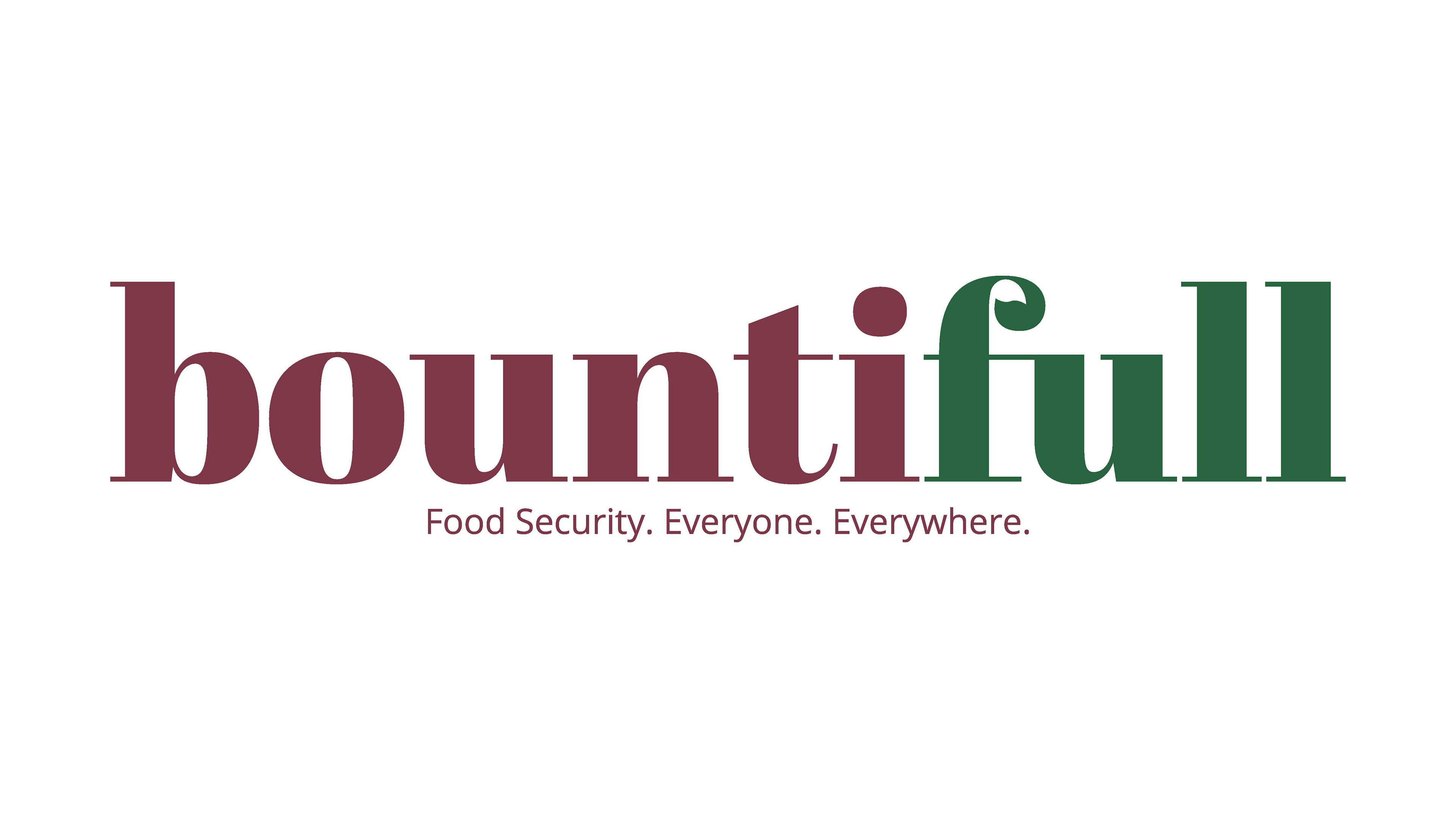
Bountifull incorporates the community driven vision of this social venture plan. The word "bountiful" connotates a
growth, increase and abundance, while the play on the word "full" reflects the company goal to give food security to everyone, everywhere.
growth, increase and abundance, while the play on the word "full" reflects the company goal to give food security to everyone, everywhere.
Process: Logo Design
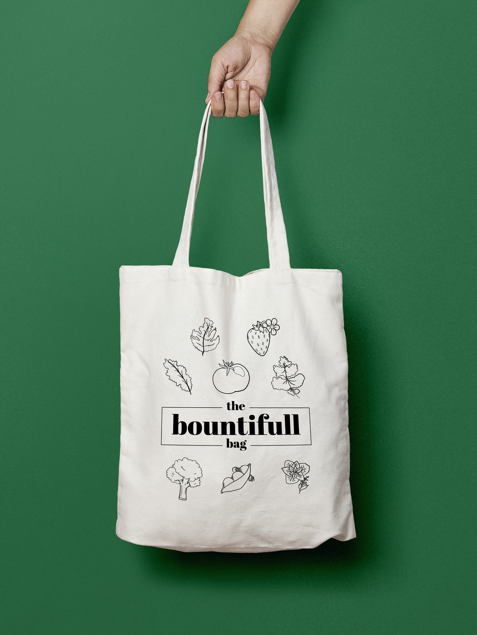
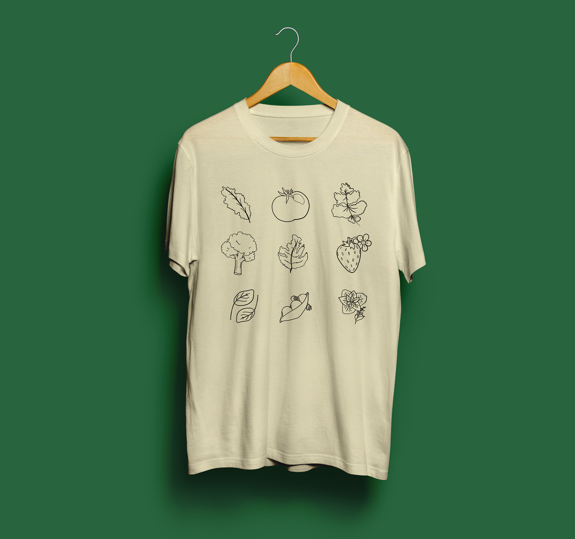
The logo encorporates a more traditional serif font with an emphasis on the curvature of the typeface. This mark was created to be professional, yet approachable. Bountifull was created to help communities, and in that way we designed using more organic curves and shapes to create approachability. We also added the subtle leaf silhouete to show the "roots" of the company.

Process: Color
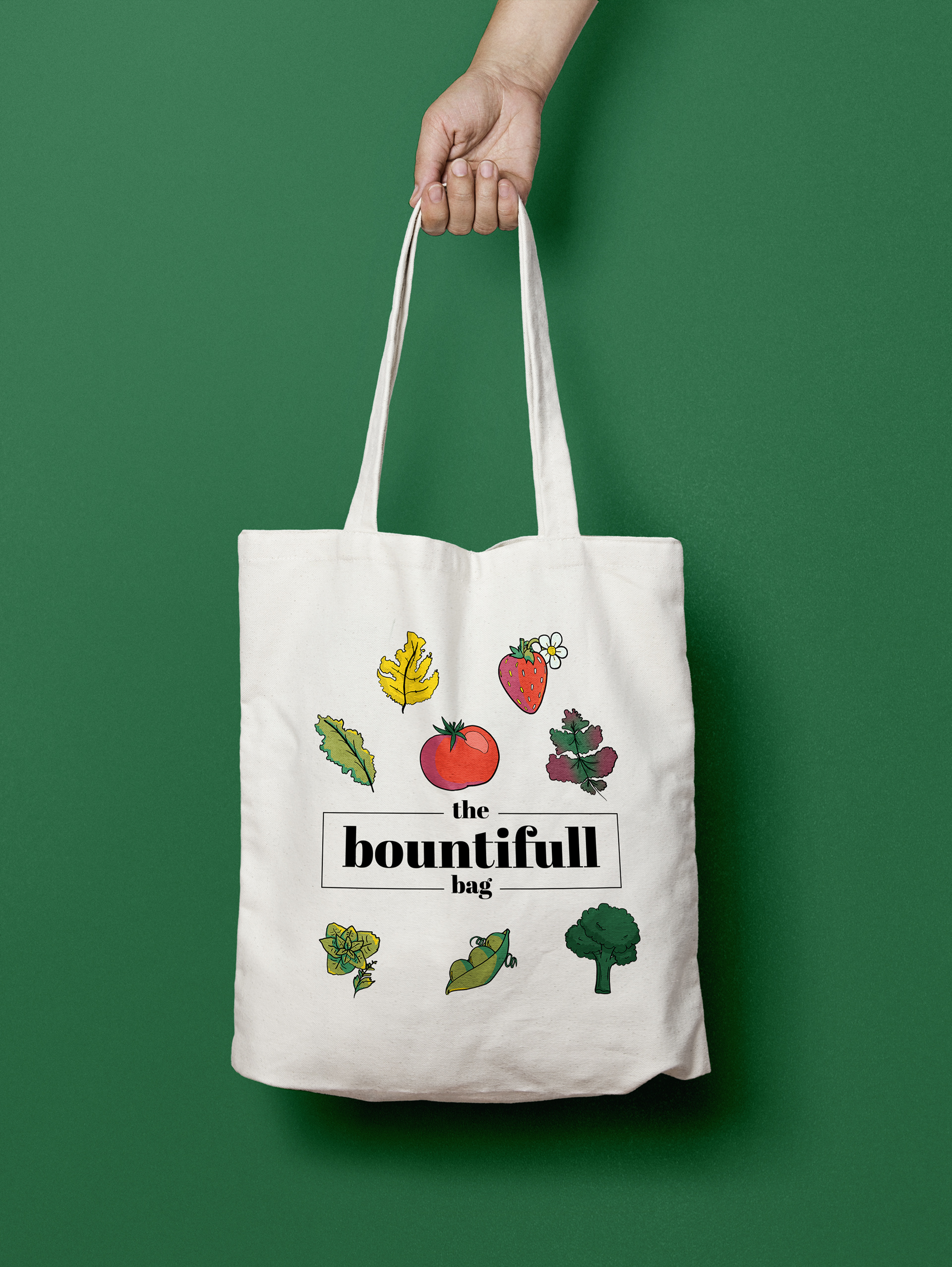
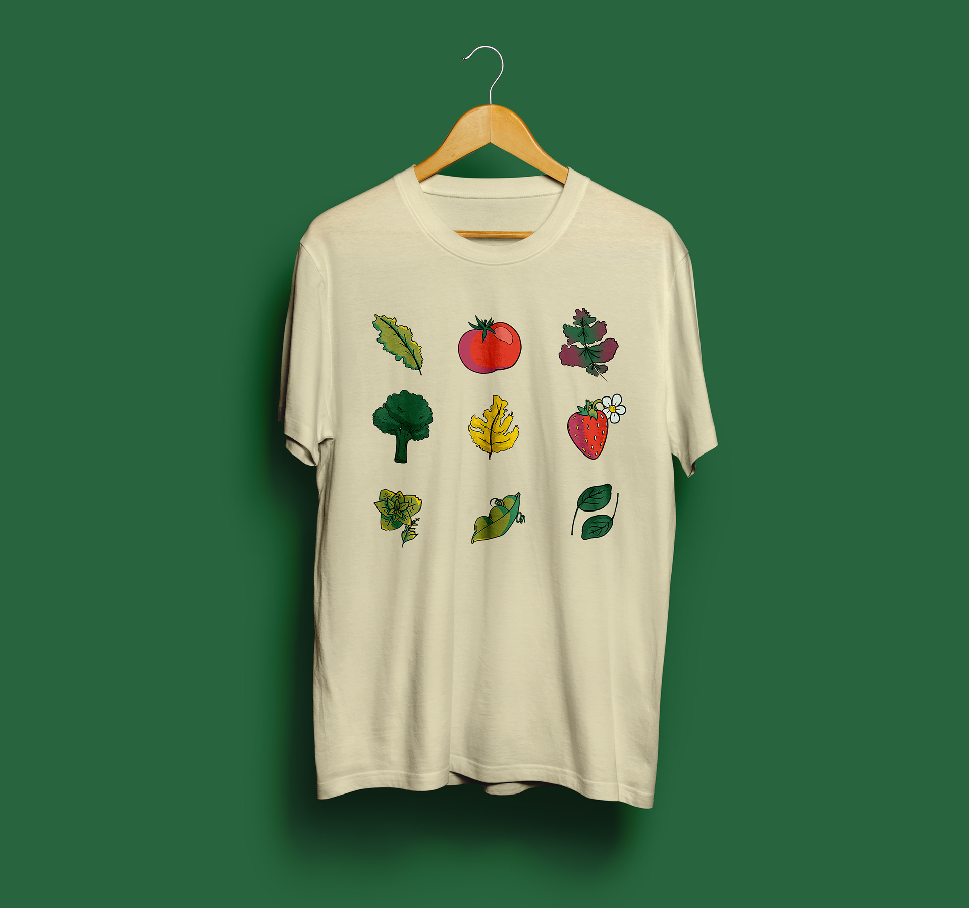
In the winter, much of Alaska's natural environment is dark, cool-toned hues. For Bountifull, we wanted to juxtapose the natural environment in the attempt to bring warmth and light to communities. We did not want the branding of Bountiful to be interpreted as a traditional farming/food service, so we moved beyond the stereotypical farm color connotations with the additions of "Radish" as a warm burgandy and "Strawberry" as a red-orange hue as opposed to the traditionally used "barn red".

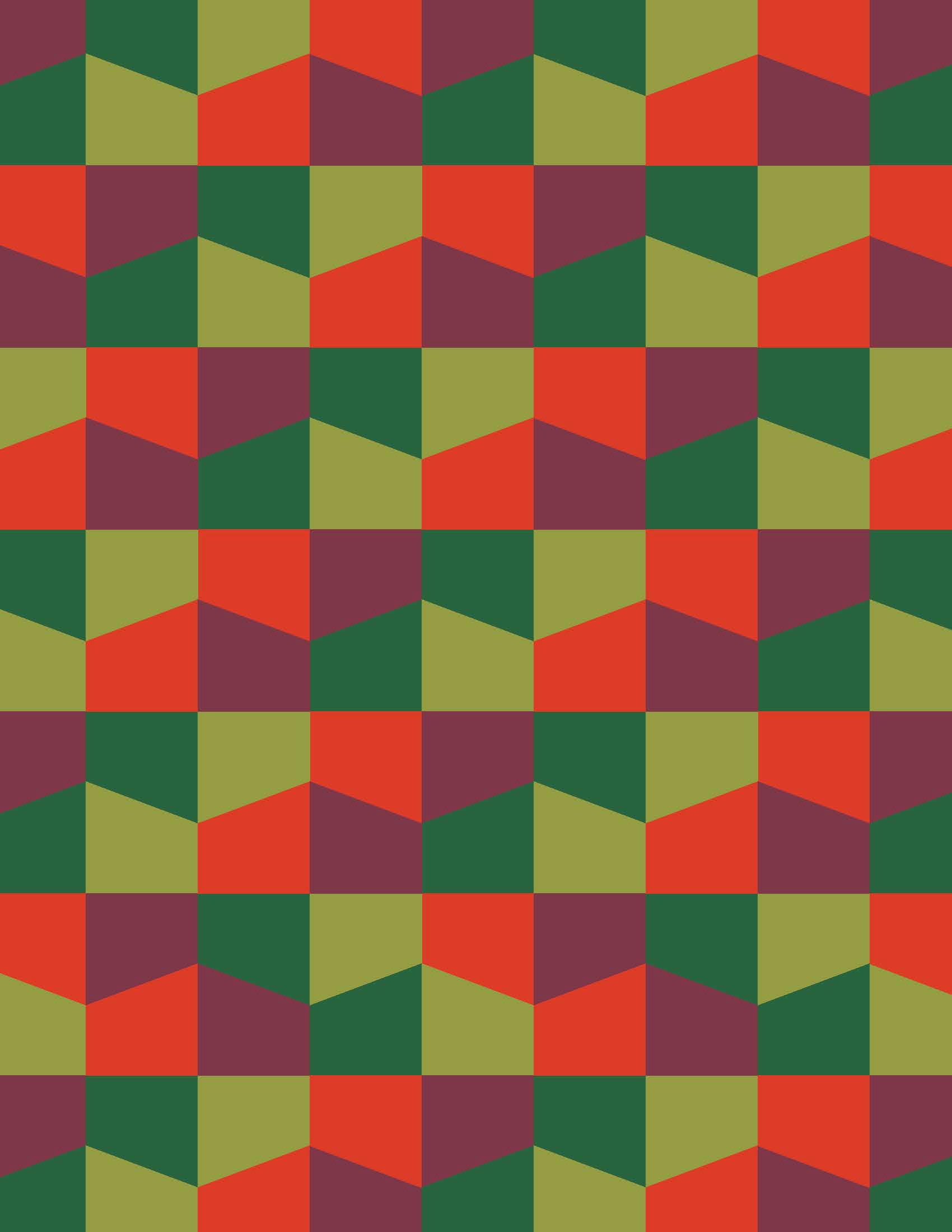
Process: Pattern Design
The sub-arctic greenhouse design of Bountifull is modular, and that is what inspired the creation of the patterns. I started with the repetition of the greenhouse outline, and was able to flip and rotate the pieces as necessary to create the tiling pattern. From there I created three different colored versions to use for a variety of purposes within the branding and asset creations for the company.


Final Assets
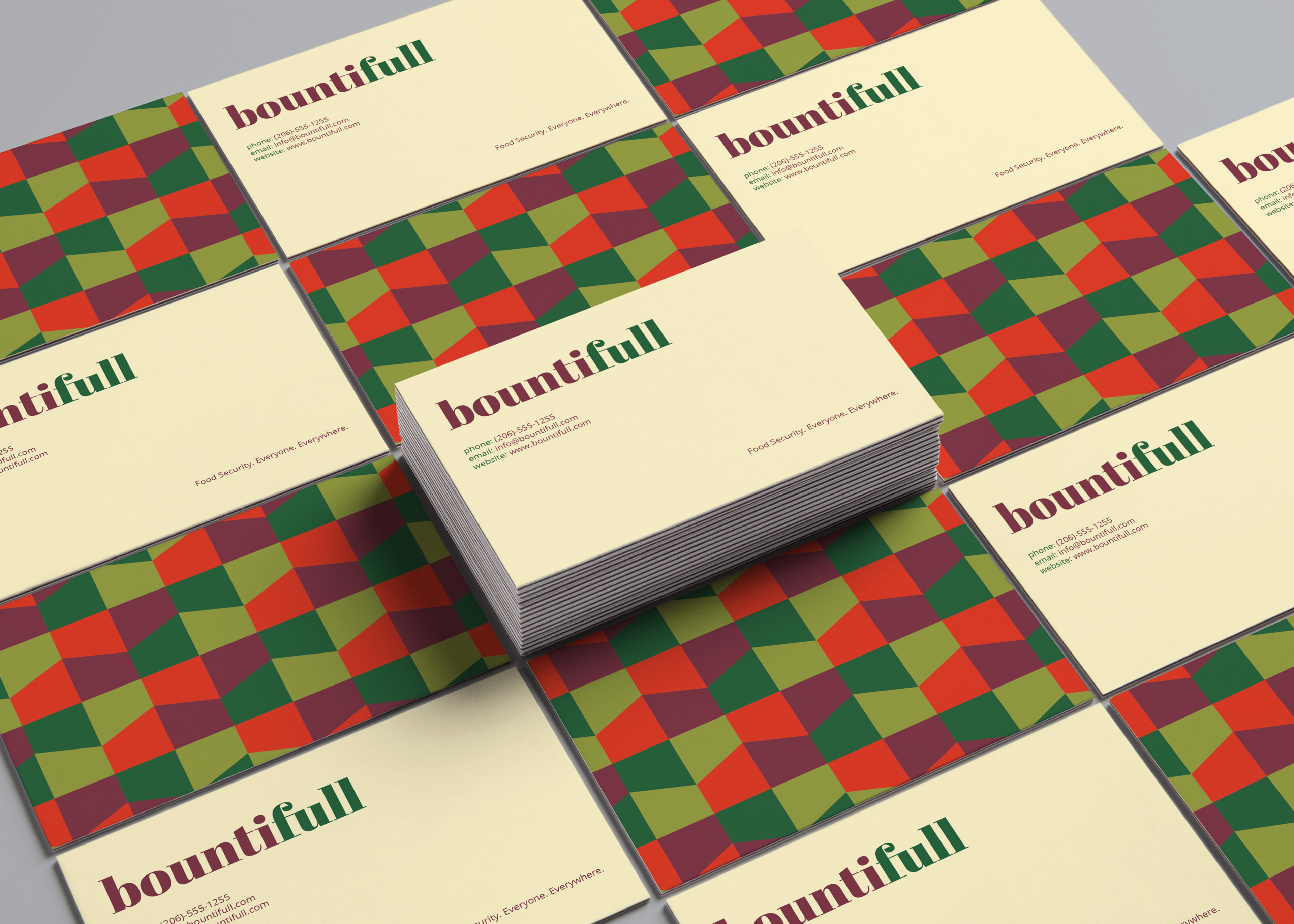
Business Card Design

Bountifull Stationary including business card, letterhead, and envelope design.

Bountifull marketing mailing flier (front)
Bountifull marking mailing flier (back)
Bountifull "Our Story" flier (front)

Bountifull "Our Story" flier (back)